Document Header UI Change
Hi
 Morgan
When working through some feature specs on the document workflow I noticed a piece of UI in the header surrounding document state which I felt could be improved. I just wanted to get your weigh in on the change to make sure it is still in line with how you would like it to work.
The idea behind this change is to remove redundancy and clutter to improve clarity on the information being displayed.
Please take a look at the attached screenshots.
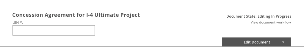
This is what the header used to look like:
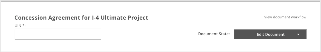
This is with the UI improvements applied:
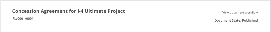
and this is an un-editable variation:
Please let me know what you think.
When working through some feature specs on the document workflow I noticed a piece of UI in the header surrounding document state which I felt could be improved. I just wanted to get your weigh in on the change to make sure it is still in line with how you would like it to work.
The idea behind this change is to remove redundancy and clutter to improve clarity on the information being displayed.
Please take a look at the attached screenshots.
This is what the header used to look like:
This is with the UI improvements applied:
and this is an un-editable variation:
Please let me know what you think.
I guess I'm fine with the change if it's something you recommend. However, is there not a benefit to displaying the document state, rather than requiring the user to open up the workflow link?
Morgan
Kev and I are looking over the differences between Task, Status, and State. We agree that document state should be included in the header, so Kev will revisit and edit the specs.
Thanks
Megan
Morgan