Site Mockups
Hi Morgan,
Please find attached the mockups for the public site.
I should have mentioned in our call I have included placeholder text along with the call to action above the footer on some of the pages. This was done where 'benefit oriented product statement' was suggested to accompany the calls to action, but the content was not included. This can easily be omitted should you choose to do so.
Thank you,
Mel
Also,
Thanks,
Morgan
We will take a look through the mocks and annotate with any feedback by Monday. Does that work with everyone?
Thanks,
Tiffany
Morgan
Here's a PDF.
Mel
The Quietly team actually had some time this afternoon to sit down and go through the mocks - looking great! We've provided specific annotations and questions in the PDF itself. Please take a look and let us know if you'd like to hop on a call to discuss. Otherwise, some general comments:
Thanks,
Tiffany
Thank you for all the comments and annotations above, they all make sense to me, and should be implemented, unless others disagree and further discussion is needed.
Let me mull over the choice between Homepage 1 and 2. I'll wait until we've heard feedback from everyone before making a final decision.
Thanks,
Morgan
I've circulated the mockups above internally, and no one has any further comments beyond the ones already addressed by Tiffany and Julia. Also, we all prefer homepage #2, so let's proceed in this direction.
Thanks,
Morgan
There seems to be some disagreement between Homepage #1 and #2. The ISLG team and my preference is for #2, but Quietly and Monica prefer #1.
With regards, to Monica's other comments, I think we should defer to Industrial's suggestions on UX, but please implement Monica's suggestions concerning visual design and adhering to the branding guide. Also, I agree re testimonials, either use quotation marks or italics, but not both.
Morgan
We will go through and implement the changes above.
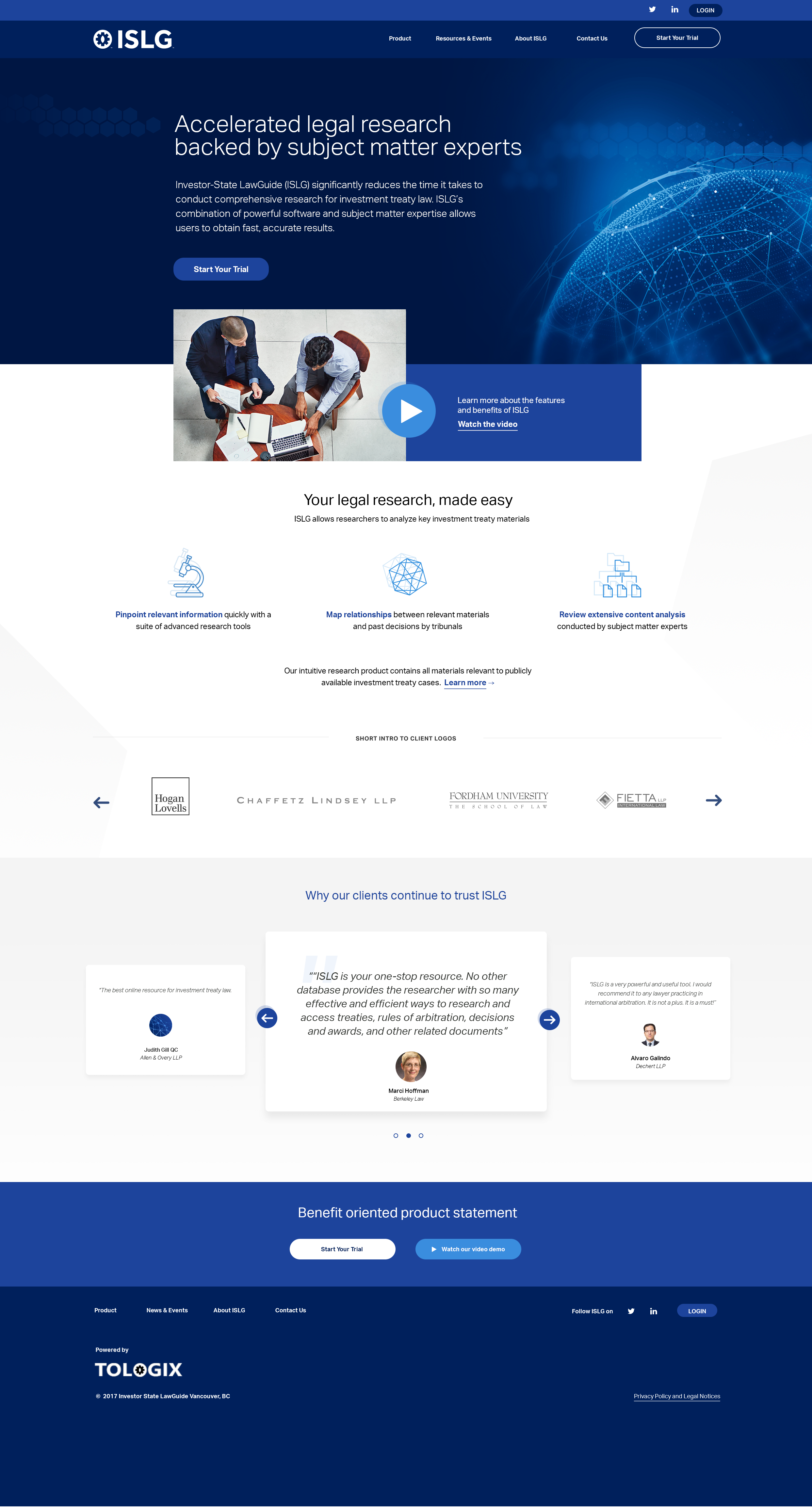
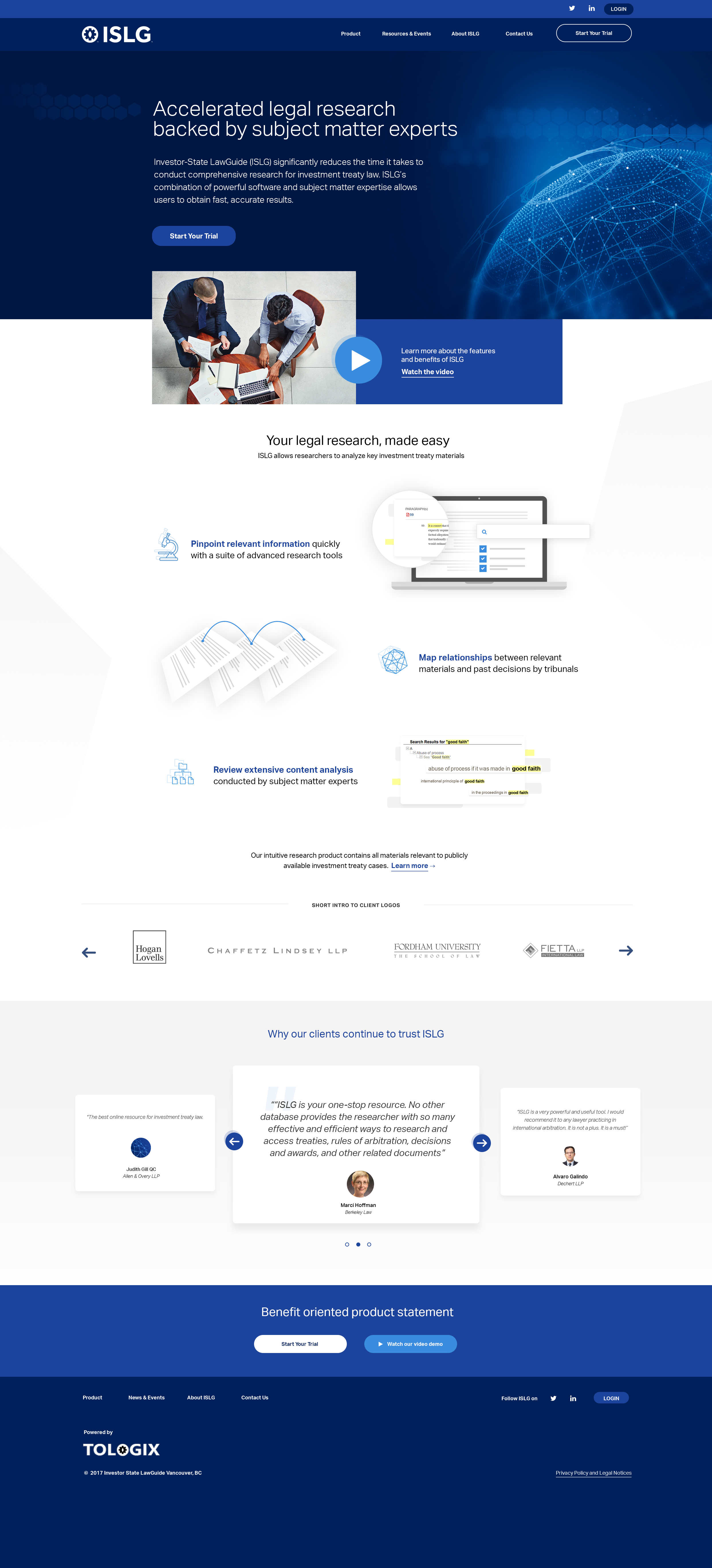
In terms of the homepage, we feel the added visuals in option #2 give the visitor more context and incentive to dive deeper into the content. This visual approach feels fresher and more marketing forward. However, we do understand the desire to have the product benefits higher on the page. We have included a mockup to illustrate how we could meet in the middle. This third option combines the clear, straightforward layout of #1 with the visual appeal of #2.
Let us know what you think.
Mel
I like version 3. Maintains the visual component that I liked about #2, but looks a lot cleaner, and brings the client logos and testimonials higher up the page.
Morgan
Thanks for the additional version, Melissa. It's definitely maintains a cleaner layout and middle ground between the two. However, we do still prefer v1. Here are some considerations around v3 in terms of our thinking when it comes to the content and design experience.
In v3:
- Overall, we feel the Homepage should really speak to the benefits first, before jumping into representing the specific product features. The bigger graphic elements are product-focused (vs. relating more generally to the user benefits) and could just live on the Product page.
- There are both the 'icons' and bigger 'graphic elements' underneath, that represent the features. Not sure you need both to speak to one benefit and we think it would be cleaner with just one or the other.
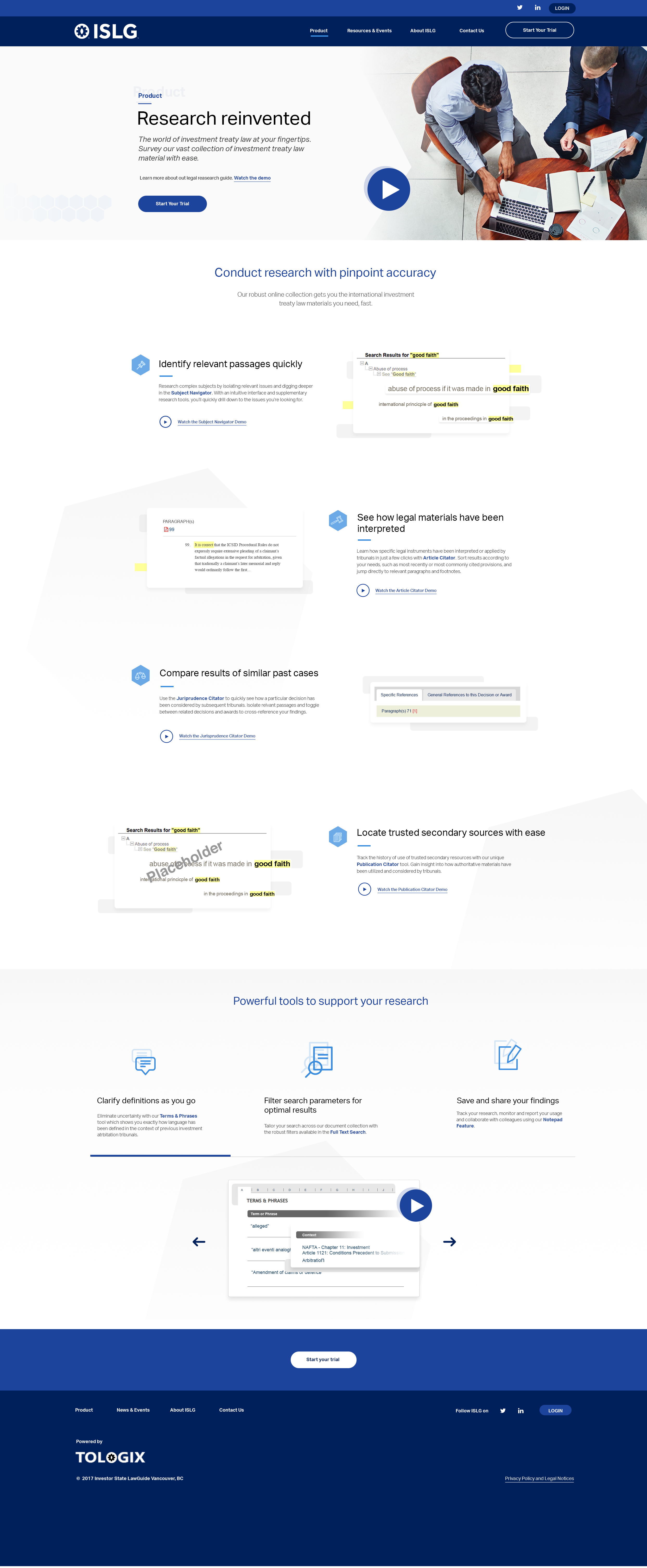
- On the same note, with all three of the bigger 'graphic elements', there is some design inconsistency - the first two are conceptually designed visual elements while the third one for 'Review extensive content analysis' appears to be an actual screen shot of the product. If you you were to keep these in design, we recommend to design the third one into a 'conceptual design element' like the first two.
- Lastly, currently the same screenshot being used on the Product page to describe "Identify relevant passages quickly" (re: above) is also used to showcase "Review extensive content analysis" on v3. Though they are related, this may create confusion as to whether this one feature does both things.
Again, by no means are the above considerations show-stoppers (the are very minor!) but we wanted to provide additional context to our preference. We think all three versions are great so the decision is ultimately up to you and the ISLG team, Morgan.
Thanks,
Tiffany
I agree with Tiffany's comments about keeping the screenshots conceptual given that we want these screenshots to be relevant in the new application if possible, so that we don't have to replace them down the road.
Also, I think we should update the icon from "Review extensive content analysis" with the icon being produced for the intro video that represents subject matter expert performing their analysis (unless other disagree). Here is a screenshot from frame 8 of the storyboard.
Thanks,
Morgan
Cheers,
Tiffany
Let's proceed with getting the mockups updated, and we can replace the icon when it's ready (again, assuming we agree on this point).
Morgan
Please find attached the revised mockups. I believe these capture all the required changes.
Let me know if you need anything else.
Mel
I think some of the things I mentioned were not done. Could you please take a look at my pdf? I wrote them, again.
Let me know if you have any questions and/or if there are things that can't be changed, at this stage.
Thanks
Thanks,
Morgan
For now I have left out the circles around the icons (product page, resources, signup). Throughout the site, circles have been reserved for actions items like nav buttons, play buttons etc. I am hesitant to add these as strictly design elements as it may confuse the visual language.
I have also chosen not to add division lines on the product page. I did try it and felt it made the layout too busy.
Morgan
I understand the reasoning for not having circles but now the icons look as if they're floating in space. I can see what you mean about actions but I feel like the arrows in them tell you to click on them but not a mallet or others. What if all "action" arrows are filled circles and we do line-only ones for the features ones? I'm even wondering if we need them. It feels like we're using a lot of them, now. Thoughts?
Just following up to see where we're at on resolving all the outstanding comments from the mockups. Are you waiting for
Also,
Thanks,
Morgan
For a launch before April 15th we'd have to ask
Thanks,
Stephen
Let's integrate this into our scheduled call for next Thursday given that
Thanks,
Morgan
Below are the mockups with the final requested changes.
Mel
The changes look good to me. Just a couple of minor modifications:
Thanks,
Morgan
Mockups for final approval below.
Thanks,
Tiffany
The only placeholder image on the product page is the one for the Publication Ctiator (because it's not in production yet and will be replaced at a later date) yet. The image for the Subject Navigator and Article Citator are representations of actual screenshots for these tools, and the Jurisprudence Citator's image is a representation of the historical line of cases created by treatment throughout the case law (i.e., the research task the tools performs).
What further changes did you have in mind?
Note that we need to get this finalized today, so that we can move on to the next stage in the development process. Perhaps we can leave things as is, and discuss modifying these at a later date?
Thanks,
Morgan
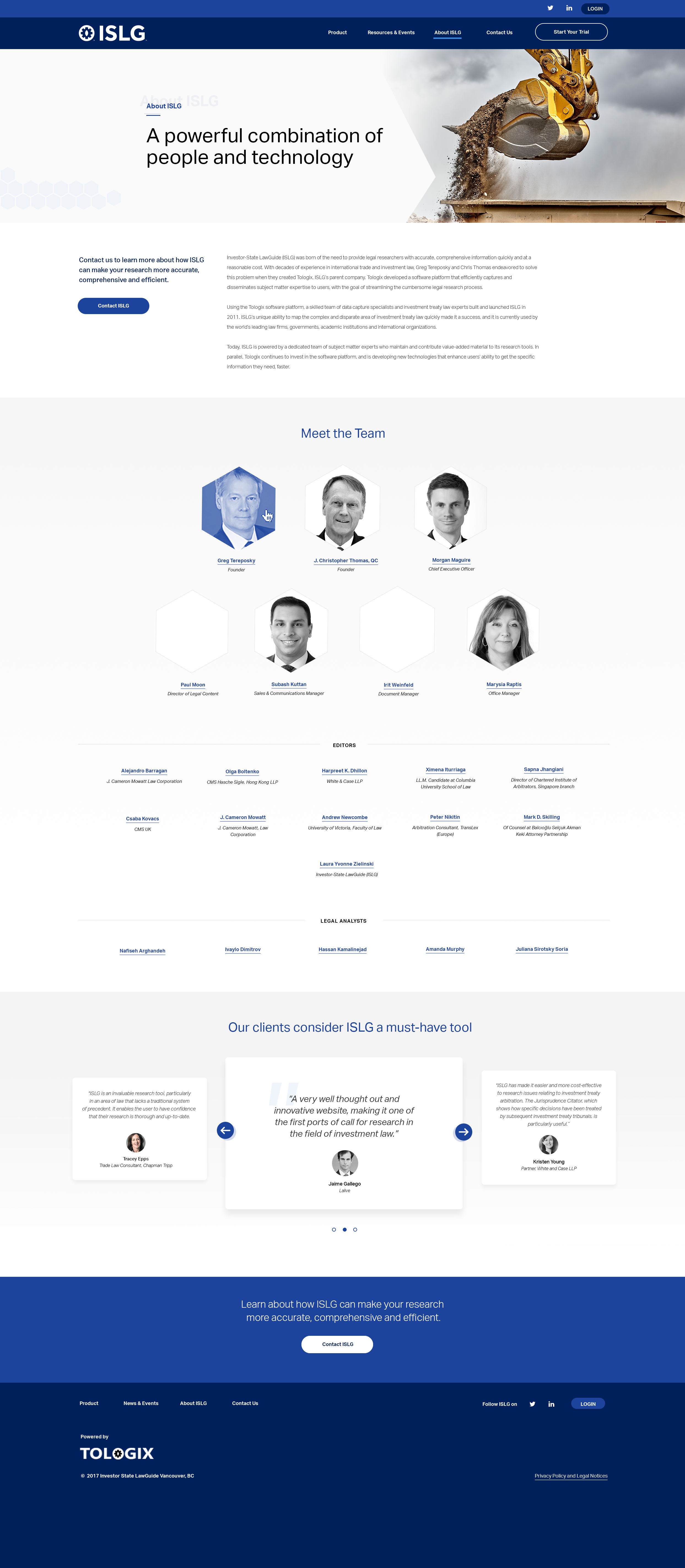
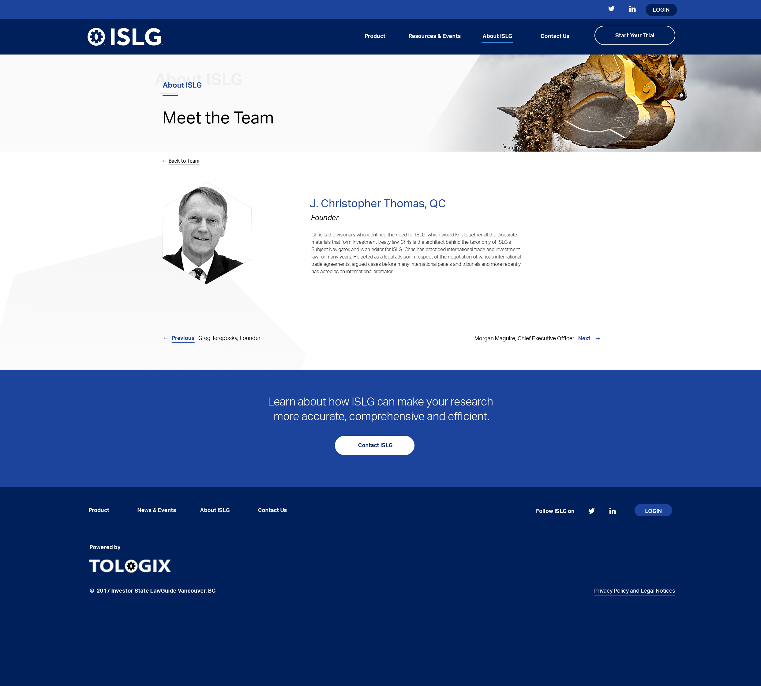
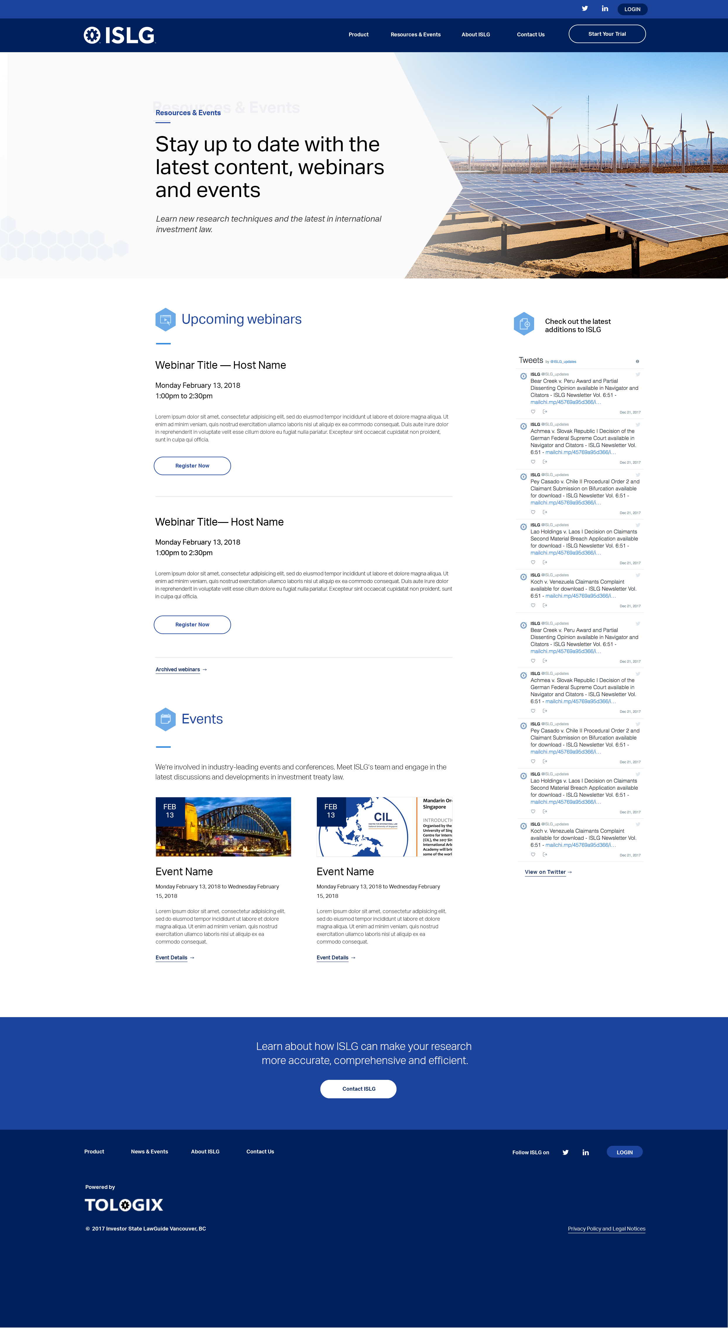
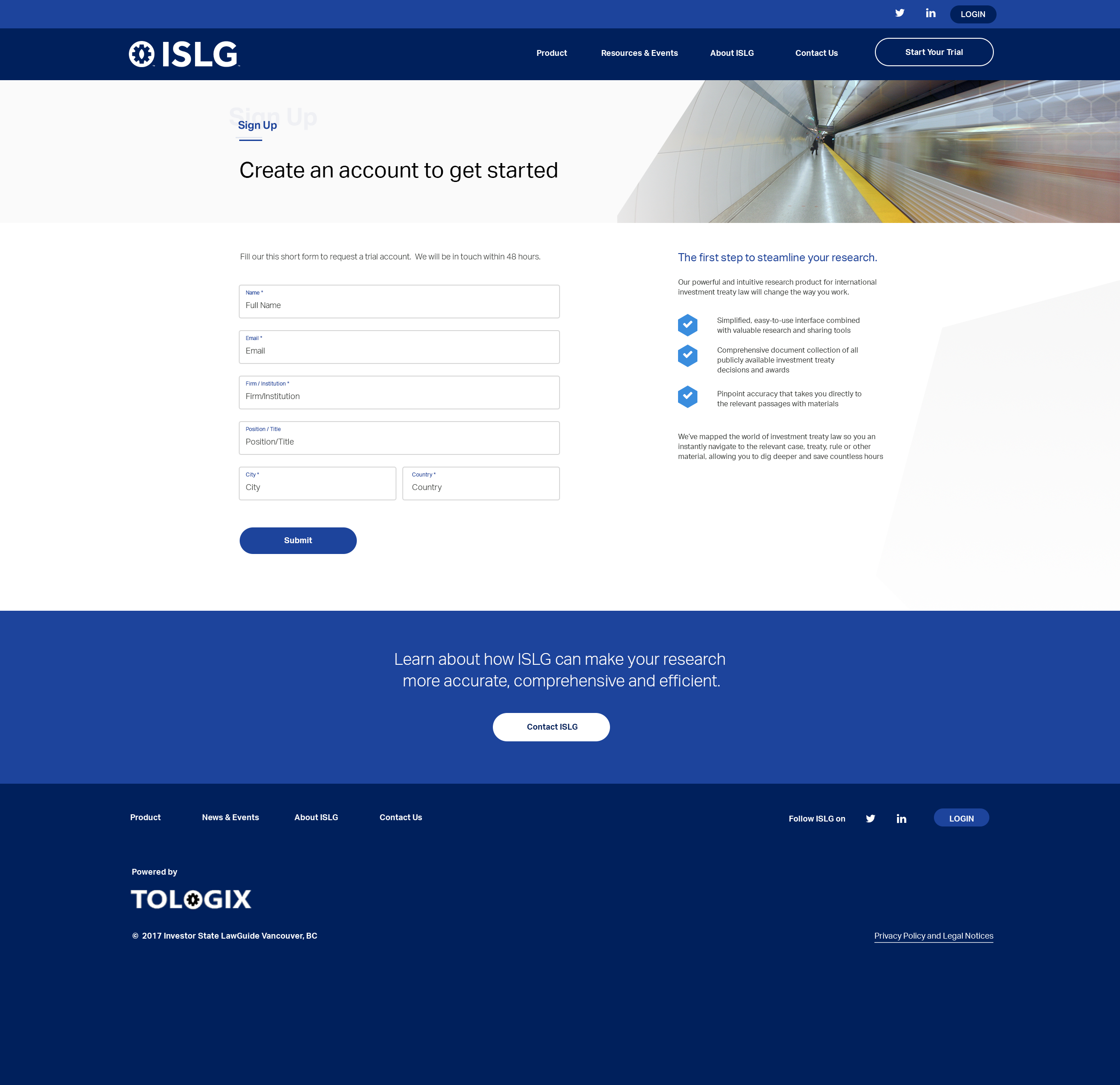
We were referring to the header images on each page. (e.g. the construction image of the backhoe, the windmills, the TTC subway).
If these are final images - our question was around the thinking of how these reflect the purpose of the page, the ISLG brand and/or relate to the end customer.
Sepcifically:
About ISLG: How does the construction image reflect the copy "A powerful combination of people and technology"?
We understand these need approvals today, but would suggest considering sourcing more relevant images before the site goes live and would defer to design as this is part of the visual storytelling (that complements the content).
Thanks,
Tiffany
I see what you're getting at. The header images are meant to represent the industries or sectors that are involved in investor-state disputes, which are outlined in the branding guide below. These are meant to relate to the industries users represent, rather than the function of the page.
Does that make sense?
Morgan
Thanks,
Tiffany
OK. Assuming
Note that I'll be sending a separate message with details on next steps.
Thanks,
Morgan
Thanks
Here you go. Most comments I had made previously, so if the changes can't be made or you decided not to do them, please ignore.
Thanks
Having said that, we need to move forward, which will be illustrated in my separate message, so the next version
Thanks,
Morgan