✔ More problems with front-end filters
Completed by Morgan M.
- Assigned to
-
 Anil V.
 Stefanie G.
- Notes
-
Further to the video below, I have some additional issues with the front-end filter:
- explore creating new method for applying filters. Currently, the user needs to select "search", but I would suggest either an "apply" button next to "clear fitlers" or have them automatically applied as they are selected or deselected (assuming we can do this without any noticeable lag created by re-loading results).
- separate "clear search" button (and "apply" button) from the scrollable filter window so that the button(s) is always visible.
For this to-do, please chime in if you think anything I've suggested is off-base.
Thanks,
Morgan
Filtering result automatically e.g. by selecting/deselecting a value will create performance issues. As you suggested, we will put "Apply" button next to "Clear Filters". Hope this is fine.
Above changes are done and uploaded on p3lg. Please review and let us know the feedback.
Just a few small things:
There's a random arrow here:
I'm thinking that we should have the filters always fixed on the left (so that you can't scroll past them) and also move the apply/clear up so that these are always visible. Right now I'm finding the scrolling a little difficult because you have to use page scroll to actually see the apply/clear filters page.
The other thing is that the results don't change when you clear a filter. If clearing the filters doesn't provide an updated results list, this is a little problematic because the user would have to re-search.
We have uploaded your suggestions on p3lg except fix the filter. It would be great if
We have reverted the buttons. Please check.
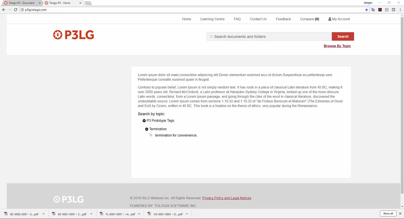
The presentation of the filters looks good to me, except for the miscellaneous arrow below the Project Filter still appearing:
Thanks,
Morgan
Morgan
Sorry about this, this might be because of a new version uploaded today. We will resolve this in next upload.